Why Your Website Should Sell, Not Just Sit There
8 October 2026 · 7 min read
Vyom Solution
Founder & Lead Designer
Vyom Solution is a web studio based in India, designing and building custom websites for founders worldwide.
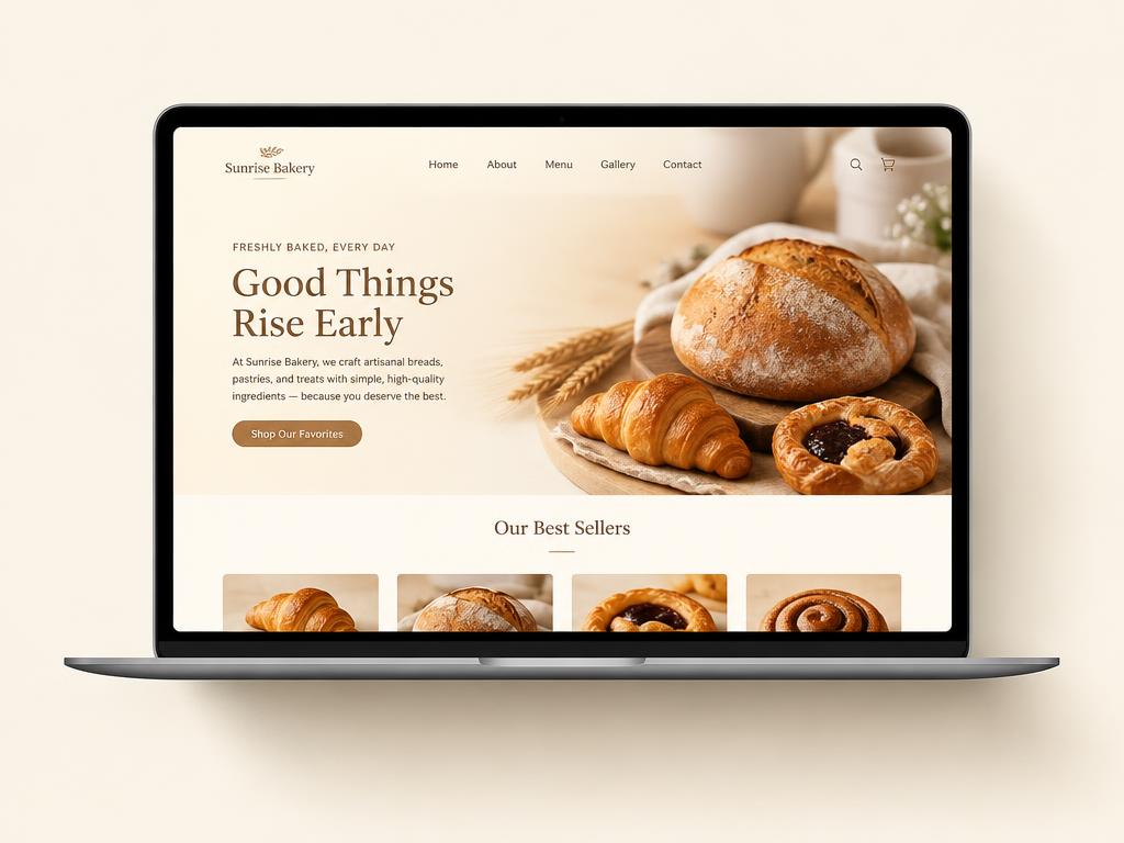
A website that only looks nice is a cost. A website that sells is an asset. The difference is rarely the budget — it is the intent behind every section, every headline, and every button on the page.
Most small business sites fail quietly. They get visits, visitors scroll for a few seconds, and then they leave — not because the business is bad, but because the page never told them what to do next. This piece is about fixing that.
▪The ten-second test every homepage must pass
When we build a site, we start with one question: what should a visitor do in the first ten seconds? If the answer is not obvious, the design is not finished.
A visitor lands on your page with three silent questions: is this for me, can these people actually deliver, and what do I do next? A selling homepage answers all three above the fold — before any scrolling, before any reading.
▪Brochure site vs selling site: the real difference
The gap between a site that sits there and a site that sells is not animation or fancy fonts. It is structure. Here is how the two compare, section by section.
| Section | Brochure site | Selling site |
|---|---|---|
| Headline | Welcomes the visitor | Names the visitor's problem |
| First screen | A nice photo and a logo | A promise, proof, and one button |
| Middle | Long paragraphs about the company | Real work, real numbers, real client words |
| Ending | A contact page link in the footer | One clear call to action, repeated |
| Goal | Exist online | Start conversations |
▪The three jobs of a homepage
Every high-converting homepage does three things in order: it says who it is for, it proves you can deliver, and it makes the next step effortless. Miss one, and the other two stop mattering.
- ✓Clarity first — one headline that names the visitor's problem, not your company name
- ✓Proof second — real work, real numbers, real words from clients, placed early
- ✓Action last — one button, repeated down the page, that never asks for too much
▪Cut before you add
The fastest way to improve a site is to remove things. Every extra menu item, every stock photo, every paragraph of filler is a small tax on your visitor's attention.
A focused one-page site will almost always outperform a sprawling ten-page one for a small business — because focus is what converts. When everything is important, nothing is.
This is also why we build in 21 days instead of two months. A focused timeline forces the hard questions early: what do we say, and what do we ask the visitor to do?
▪Action Steps
- 1
Write your ten-second answer: in one sentence, what should a first-time visitor understand and do?
- 2
Audit your homepage against the three jobs — clarity, proof, action — and mark which one is weakest.
- 3
Remove one thing this week: a menu item, a stock photo, or a paragraph nobody reads.
- 4
Make your main button impossible to miss: one action, repeated, in a colour that appears nowhere else.
- 5
Ask one real client for two sentences about working with you, and put them near the top.
▪Frequently Asked Questions
Does a small business really need a selling website?+
If you get work through referrals, your site is where those referrals go to check you. A page that sells turns a warm introduction into a booked call instead of a silent bounce.
Can a one-page site really be enough?+
For most service businesses, yes. One focused page with a clear story converts better than ten thin pages. You can always add a blog or case studies later.
How do I know if my current site is selling?+
Look at enquiries, not traffic. If people visit but nobody reaches out, the page is not doing its job — no matter how good it looks.
What should my main button say?+
Name the outcome, not the action. 'Reserve your spot' or 'Get your quote' beats 'Submit' every time, because it tells the visitor what they get.